This entry picks up the story behind my first data science project predicting hail damage to farms. In this article we identify data quality issues in our first data source.
Property and Crop Damage
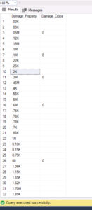 In the NOAA documentation these two columns were recorded to say how much property and crop damage occurred in a given storm report. This damage is supposed to be recorded in the amount of damages in terms of dollars. The DBA in me would think these values are recorded at decimal, or maybe even integer if we were rounding to the nearest dollar. That’s not what we have here. In this set we have the following text information.
We see values like .78K, \N, 0.10K, .45M. So we have to translate these odd strings into numeric values. Nothing horrible, but this is the kind of thing you find in your sources you have to clean up before you can perform any real kind of analysis on the data. We also see that most often, records in this source either have null or 0 for the damage values. So it turns out this column has very little value to us in determining a relationship between hail stone size and damages.
Location Issues
We did see two sets of coordinates for each record: a beginning latitude and longitude, and an ending latitude and longitude. 223,000 of the 240,000 have coordinates, but not all of them have coordinates. Fortunately, all of the records have a state and county associated with it. I also discovered these records used FIPS (Federal Information Processing Standars) codes for state and county. Crop insurance rates are also based on these codes. So I quickly found the lookup tables that would translate these codes to state and county names.
Since we don’t always have coordinates, and FIPS codes are used by both NOAA and crop insurance, I decided to use the FIPS codes for my analysis, rather than individual coordinates.
Visualization and Exploration
With the data cleaned up, it was time to take a first pass at visualizing the data and starting to look for some patterns within the data. My tool of choice is PowerBI, since it can help with a lot of the layout and choosing which visual is best in each case. I wired up a new pbix file directly on top of the single csv I generated from the source files. 240,000 rows in a single file takes PowerBI very little time to process.
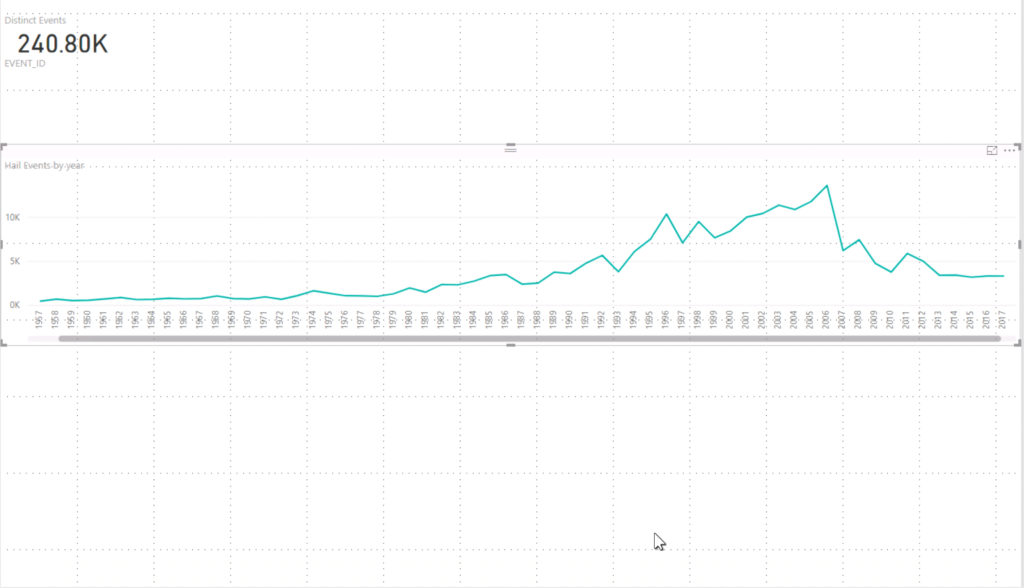
One of the first assumptions I wanted to test was whether or not we were seeing hail more frequently each year. You know, global climate change and all is making severe weather more frequent, right? I put together a quick timeline plotting number of hail events per year. Looking at the trend line from 1955 to 2006, you’d think so. But look at the numbers following 2006. We’re back to 80’s and 90’s numbers. Based on this data set, frequency isn’t trending up. But, this does tell me when I look at other data sets, I would expect to see peaks in damages between 2001 – 2006.
Since this research is to help insurance companies price hail risk more accurately, and those rates are based on state and county. I wanted to look at a heat map for hail events per state, and then per county. ESRI maps are available in PowerBI Desktop now. Generating a heat map based on state names is simple. Just drag the state name column and count column into the visualization and you get the following visualization nearly immediately!
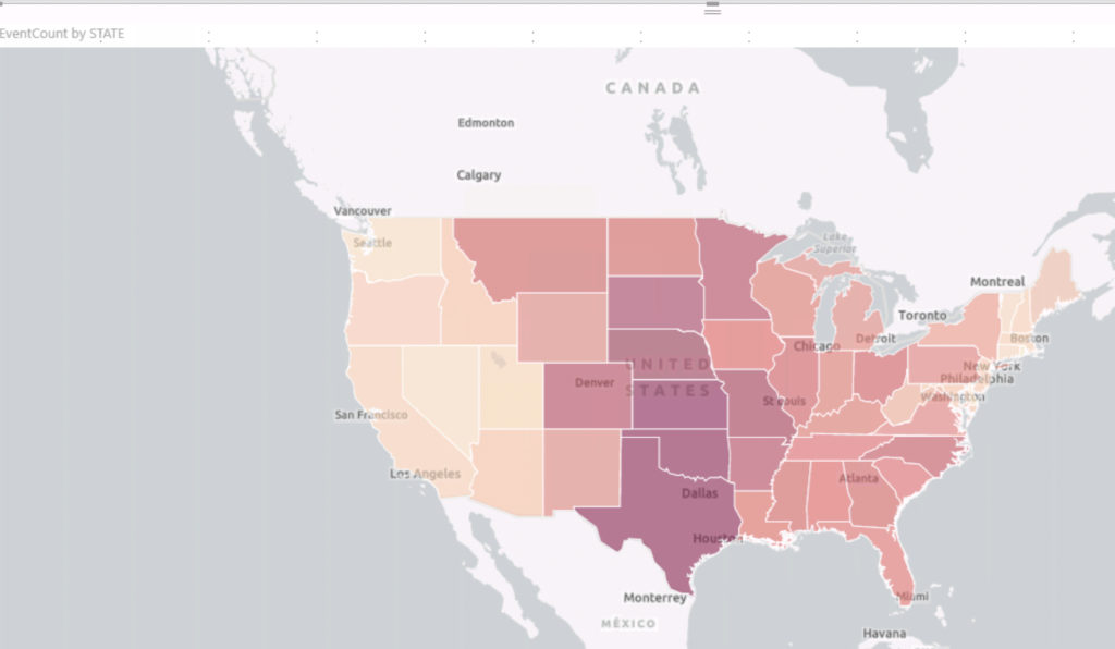
Looking at this view, hail events occur most often in tornado alley. Tornado alley is the colloquial term for the area of the United States where tornadoes are most frequent. This geographic relationship between tornados and hail events make sense: hail is created by an updraft. Tornadoes need updrafts to develop. Based on this view, the risk rating for the darkest red colored states has to be higher than those in lighter colors. Let’s look one level deeper, at the county level.
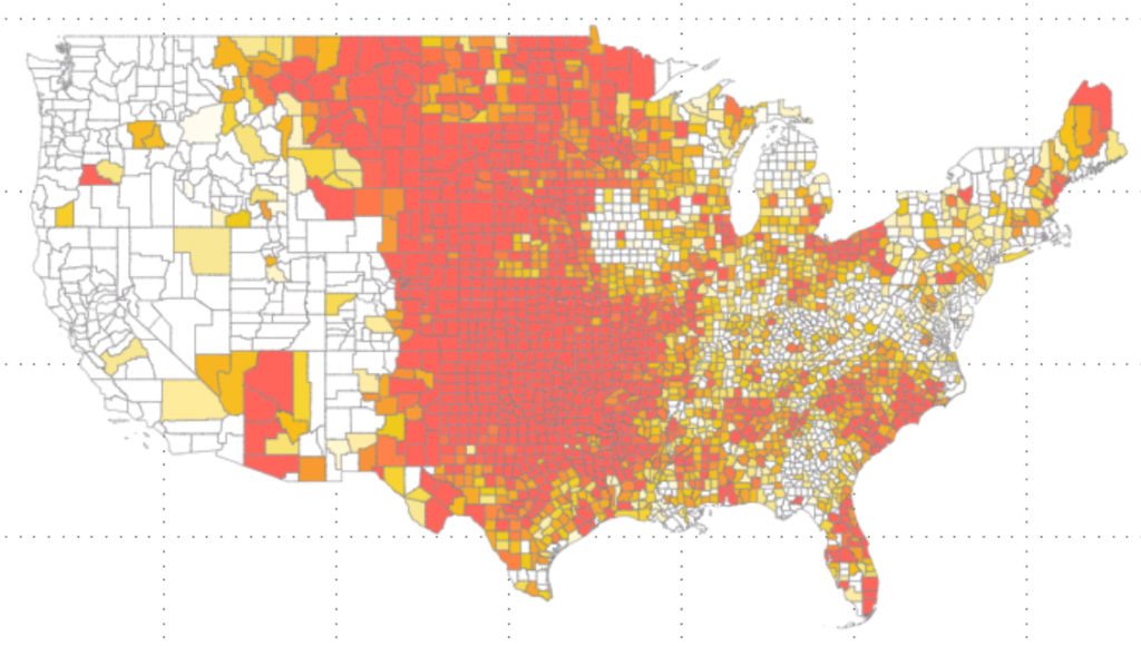
You get a much more nuanced look at hail even frequency. To generate this visualisation, I had to use the preview feature: shape map visual. I also had to find a GIS (geographic information system) shape file that could describe the shape for each county in the United States. I had to then convert that file to TopoJSON format, and then import that file into PowerBI before it could render the counties like this. That was pretty easy compared to the next step: figuring out what values to use for the colors.
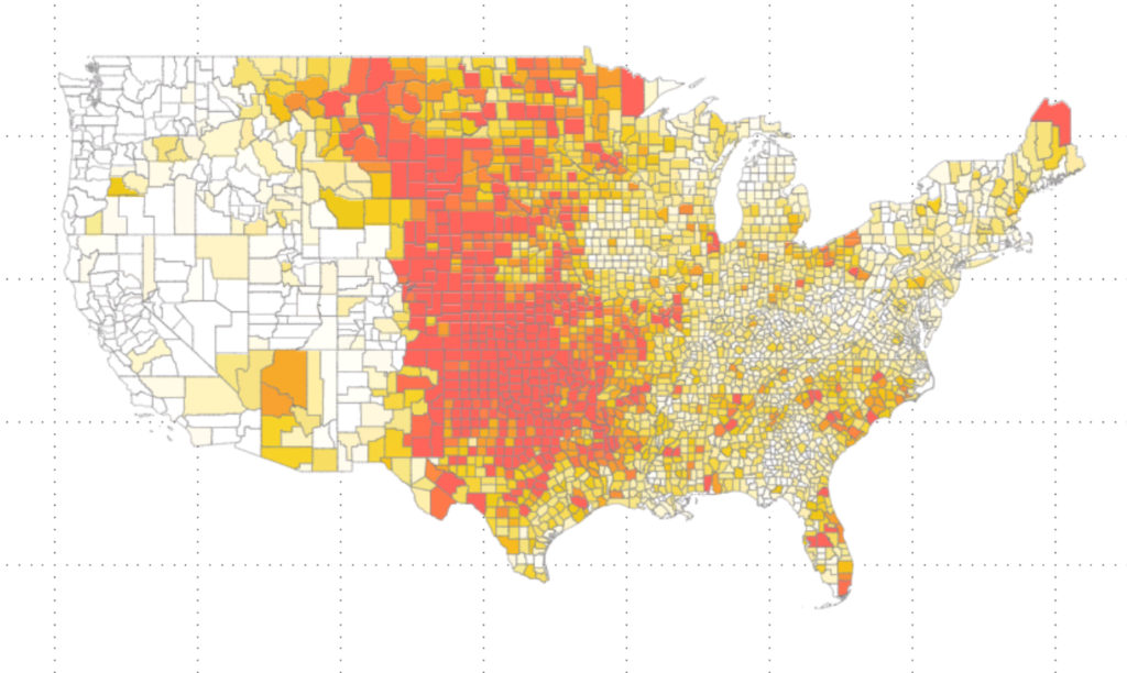
Statistical Analysis: Histogram
I wanted to show off counties that had high frequency hail events. So I took the number of hail events per county, and built a histogram with five buckets. Those in the bottom bucket would be my low risk counties. Those in the middle three buckets would be my average risk, and those in the last bucket would be my “extreme” risk group. I would then take the limits of these buckets and use them to control what color to use for each county. In the end this image appeared when I set my Minimum color value to 25 events, my center to 49, and my maximum to 98.
Tornado alley still lights up as most likely to experience hail. Look at Iowa. There is a doughnut shaped area where hail rarely happens. Farms in this area should get the lowest premiums for hail coverage. You also see that the Rocky Mountains create a barrier to hail events. The Appalachian Mountains appear to do little to serve as a barrier. Either that, or the Atlantic adds something to the equation.
Looking at frequency, questions came up around hail severity. How large were the hailstones in these events. Is there a correlation between size of the hail stone and the frequency? Are we getting larger (and therefore more damaging) stones each year? Let’s plot the magnitude by county now.
A very similar picture occurs. For coloring here, I simplified and summed up the size of each hail stone. I could have also measured “average hail size”, or come up with any number of alternate magnitude measurements. But many of them gave me a similar picture.
At the end of this part of the project I came to one conclusion: this data comes from humans reporting the event. In a previous role I learned that if you had three people counting people in crowds as they pass the same checkpoint. At the end of counting all three of your counters would return a different result. In that project, we started using an “electric eye” to count visitors. We started getting much more reliable answers. In the case of hail, we already have a sensor system recording hail events: Doppler Radar. In my next article, I’ll share the story of pulling that data into the project.
What do I want you to learn from this?
This part of the project has a little art, and a little math to it. The art part is selecting the right visualization to tell the story you want. Fortunately, I just wanted to see counts and sums over time and by location. Pretty easy stuff. But other times, this part of the project can take several days, and several meetings with stake holders to determine the best visual for the job. Johnathan Stewart has a lot of content and presentations on this. I would also suggest Storytelling with Data as a great start. This is an area where I feel like I still have much to learn.
And the math part showed up in the histogram analysis of our data. For now, it’s light math. But later, when we try to create a model, or ML solution, math is going to be a major component. Get ready for it now.